All of them are born by chance and out of love. For the love of the beautiful Mediterranean corner. A unique place, one that fills you with energy and where many artists have been inspired.
It happens to be Matthew and Rebecca Farrar-Hockley, Senior Creative Director Kurt Geiger will meet again in Mallorca. “That seems incredible, but I met Matthew 25 years ago. The fashion scene in London in the late 90s seemed to revolve around Matthew, and throughout my career he has been a very important part of my cultural heritage in fashion. At Deià that Matthew and I meet again, it’s a place that really fills my creative soul. As a British designer and supreme color magnate, collaborating with Matthew Williamson is a natural match for Kurt Geiger London, a brand where color is everything”. This is a very personal collaboration.
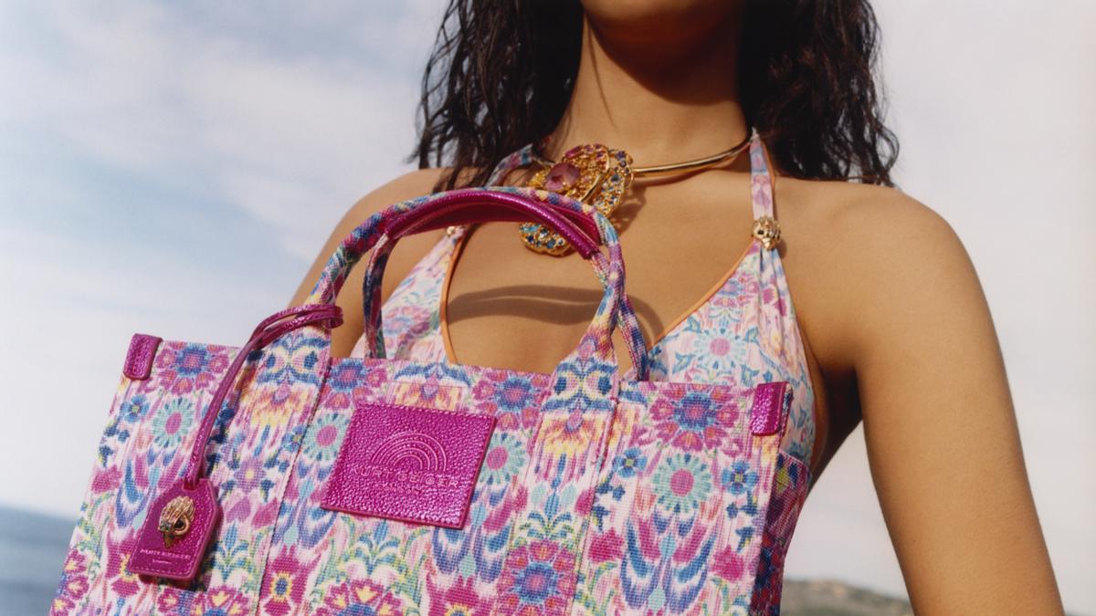
Deià, the place where the two met and the inspiration for the collection, is located in a gorge at the foot of Mount Teix, overlooking the Mediterranean and providing endless inspiration for beautiful colors. A trio of tones is present in every design: turquoise and emerald tones that evoke the sparkling Mediterranean Sea (which for Rebecca the sea in certain areas is “a beautiful shade of turquoise blue unique in the world, which cannot be found even in either the Caribbean, nor in the Antilles “), a warm hue of burnt orange speckled with deep aubergine, inspired by seductive sunny landscapes, and finally, Kurt Geiger’s iconic rainbow iteration of London, an explosion of color in a kaleidoscope.
Matthew Williamson’s special use of color through pattern stands out throughout the collection. A quilted bag in jewel-encrusted velvet, as well as sandals, a raffia bag, and a shoulder bag adorned with a printed bow and beachwear showcase Williamson’s seductive side. For her, “at the center of the collection is a beautiful print, meant to symbolize summer, based on my love of Deià and its bohemian and creative spirit. I started with florals, then I designed an abstract Ikat print to complement it. The two elements have intertwined to create prints in three color combinations spanning the entire range of bags, shoes and beach wear.”
Rebecca Farrar-Hockley, Principal Creative Director at Kurt Geiger, gave us more insight into this collaboration.
How did this collection come about?
Matthew and I are the same age. We met in the late 90’s in London, when she had her collection and was walking London Fashion Week. I used to work for Selfridge’s in those years and I used to go shopping with Matthew and then meet him at the after-show parties. I guess Matthew is part of my legacy in fashion. To me, she was a big part of the London fashion scene at the time. I’ve known him for a long time. Then we met again here because I met him when he was on vacation and he lives here.
Why did you decide to collaborate at this time?
Matthew is magic with colors and patterns. I don’t know, it just popped into my head as soon as I saw it. It would be great to do something with someone I really respect, who I think will understand what our clients like. It looks authentic and real to me. It is a collaboration from the heart.
Kurt Geiger London became famous in Spain after the pandemic. Because?
Yes, because? Don’t know. I think a lot of things are happening at the same time. We have always wanted to expand our business outside the UK. Spain is a country where we want to be successful. Just before the pandemic, we hired a new international director, Steven Sousa, who is passionate about how big business is in Spain. So that. And then the pandemic happened. And of course, one of the things that Kurt Geiger has in common is our signature rainbow. I think it just so happened that during the pandemic it became symbolic for a lot of things and for a lot of personal reasons for different types of clients. That circumstance strengthens the rainbow. But it’s actually just as strong today as it was during the pandemic. In fact, worldwide we sell as many rainbow products as black products.
What does rainbow mean to you?
For me, the meaning of a brand has a lot to do with courage, strength and diversity. That’s why our bags don’t have an eagle’s head logo on our products, because the eagle symbolizes courage and strength. I believe that the rainbow is a symbol of a brighter tomorrow. This is what happens after it rains. We all need hope and a better tomorrow in a world that is often not so pleasant. It has become a symbol of the freedom to be yourself and embrace the extraordinary individuality and diversity of people. It has a very personal and powerful message for people. And I think, from a practical point of view, it’s very good. Our rainbows always have a metallic finish and because they have all the colors, it’s actually something to go with everything.
What brings color to you on a daily basis?
I don’t know what it’s like not to think in color. Color is very important to me in my environment, in my house. They give me great joy and each one gives me a different sensation. I am very picky about color combinations, because they react differently to each other and you can create completely different feelings and emotions with them. I think a world without color would be a very sad place.
Since Kurt Geiger, you have launched a foundation to help under-resourced youth. Tell us more about this pryc
At Kurt Geiger we have always firmly believed that you can own a successful business and use it to help others have a better life. This philosophy has always been an important part of our way of thinking and we try our best to do things better and in the right way. So, especially during the pandemic, when we are all concerned about our own lives and our own businesses, we try to give as much as we can. Our UK healthcare is under immense pressure, like many others, and we are trying to support them and the people who work in the organisation. We’re also starting to use our brand voice to connect with causes we feel are important and often underrepresented. We try to challenge the stereotypes that often occur in the world of fashion. That’s why we created Empowered People during the pandemic, where we try to use the power of our brand to highlight causes and activists who we think have done something great.
From there, we decided to formalize and make that much more significant commitment and create a foundation where we commit to putting money aside to do things that help people from buying to our customers. We don’t ask our customers to contribute. We make investments on your behalf. We started working with a lot of grassroots organizations because it was important to us to reach people who could really make a difference. And we want to do that not just in the UK, but around the world and wherever our brand resonates. So we created a youth advisory board with people who have experienced different lives from us, so we can learn and they will help us shape the education program.
Young people who do not have support mechanisms in their family life. There is a lot of talent that is not recognized and wasted. This is a program designed by youth for youth. Over the three months we will be contacting many young people from public schools, community centers or specialty schools to explain what our program has to offer, which will start early next year and will include modules on buying, design, marketing, finance, business, e-commerce . So they can actually learn what they need to know to get their first job, because they will be young people who don’t have the qualifications, but who have the drive and interest to want to work in a creative company.

“Entrepreneur. Internet fanatic. Certified zombie scholar. Friendly troublemaker. Bacon expert.”

:quality(85)/cloudfront-us-east-1.images.arcpublishing.com/infobae/AMRMWFE47ZGLRAZ2KNWCYXWBW4.jpg)
