Have you ever been censored or changed parts of a view you didn’t agree with?
Over the last year and a half, the writing team has made the decision to highlight certain aspects of the report’s content. Therefore, some of the charts under development were discarded in order to focus our efforts on the most important information we had to convey through them. But this is of course very different from censorship.
Because the IPCC process is strictly related to science, it is a very close collaboration between the writer-scientist and myself as a designer. There was an idea I had early on in the process that couldn’t be integrated because of scientific data structures.
I’d love it if some of the illustrations were a little less complicated for the non-specialist. Making the visualizations clearer may be a future self-help project.
But other than the accessibility of communication, nothing related to content I don’t approve of is censored or altered.
How many visual storytellers have worked in this sixth cycle?
There are about two designers per report. Angela Morelli, from InfoDesign Lab, is a talented and inspiring information designer in this field. And, well, I’m not sure how many other designers consider themselves “visual storytellers.”
At Synthesis Report, apart from Meeyoung Ha, there have been many who participated for a concrete image, such as Ed Hawkins with climate band one of Kaj-Ivar van der Wijst in building the basic graphs of climate models. This is a true collaborative effort.
IPCC reports often contain complex language that can alienate non-experts. One goal is to break down that barrier. Like that?
Indeed, IPCC reports are intended for policy makers, and because they are approved by government climate experts, they tend to focus ultimately on expert-level understanding of climate science.
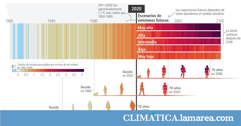
I’ve been trying to help a less experienced audience navigate a chart using arrows and hand-drawn annotations. I’ve also included icons on the most common chart axes to help you understand at a glance what’s being measured. The titles and labels of all visualizations were carefully negotiated between me and the scientist-author. While we try to use as much non-technical language as possible, some illustrations are easier than others.
Visualization is in principle always in English. Have you thought about adapting it to other languages?
All of the charts will be translated into the six official UN languages in the final report, but the process can take several weeks. IPCC member countries often provide translations into other languages.
In the age of technology and mobile devices, infographics are a valuable environmental education resource. Have you noticed a greater interest in this discipline in recent years?
There is certainly a greater appreciation of the value of creativity when it comes to communicating complex and technical topics. As for infographics, while popular for some time, the discipline is maturing. Increased attention is being paid to how visuals can be made interactive for audiences, how narrative can be embedded within visuals, and how data can be put into context to truly communicate—and even motivate—the public.

Have you always been interested in visual storytelling focused on environmental issues?
Yes, although it was a gradual evolution during my university studies, the intersection of visual storytelling with social and environmental communication has been a passion for me for many years. There’s a lot to keep exploring on this topic. Among other things, how visuals can be related to changes in behavior.
While we talk a lot about the IPCC, it also has many other projects.
I’m a professor at Minneapolis College of Art and Design and I look forward to my creative entrepreneurship classes, where I help students understand how to use their creative powers to become agents of change.
I also run a consultancy called Background Story. We are busy with many info design projects to communicate complex social and environmental issues to casual audiences in the US, Europe and the UK. Some of the current projects we have are the Minnesota Department of Sanitation, an international humanitarian organization, a non-profit organization dedicated to sustainable energy policy, an international foundation dedicated to seafood sustainability, a sustainable agriculture organization, a sustainable construction company, a green bank, etc.
Finally, what other infographics/visual storytellers on climate change and biodiversity would you recommend following and why?
Angela Morellifrom InfoDesignLab, who played a key role in some of the early reports of this AR6 cycle.
“Web specialist. Incurable twitteraholic. Explorer. Organizer. Internet nerd. Avid student.”